back to Blog
The following slide examples each show one poor and one well-designed slide for PowerPoint presentations. In general, you should aim to avoid the following common pitfalls:
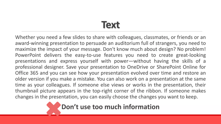
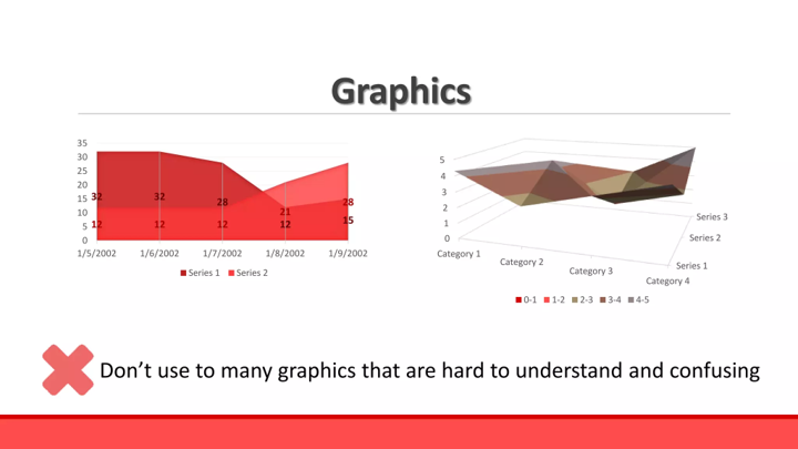
1. Slide Overload: Too much information on one slide
2. Reading the Slides: Verbatim reading instead of expanding on content
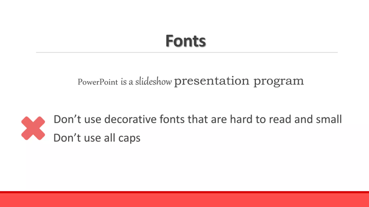
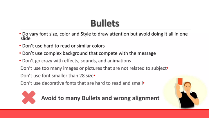
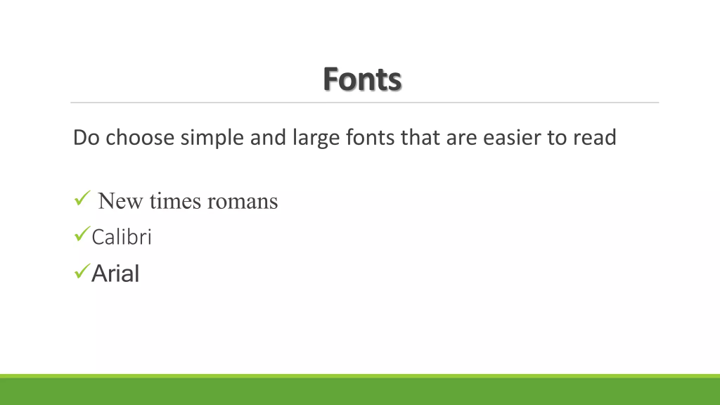
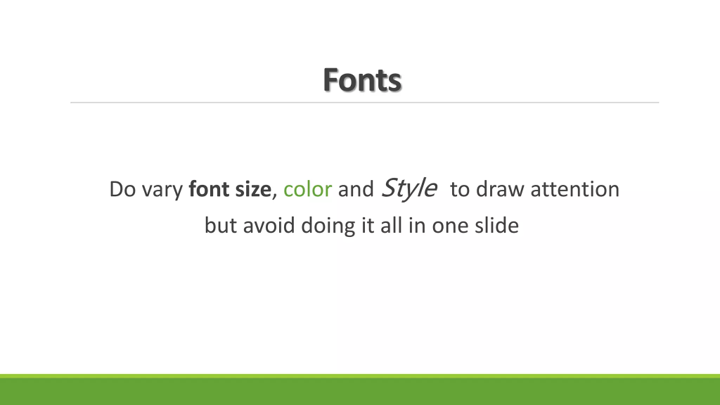
3. Inconsistent Design: Mixed fonts, colors, and layouts
4. Poor Contrast: Text difficult to read against background
5. Excessive Animations: Distracting transitions and effects
6. Text-Heavy Slides: Walls of text instead of key points
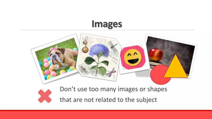
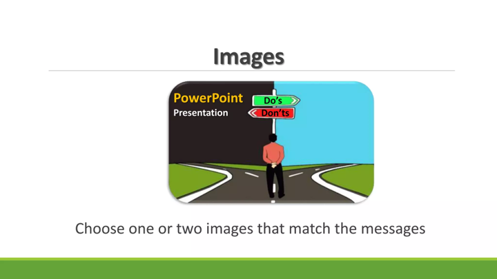
7. Irrelevant Imagery: Decorative images that don't enhance learning
8. No Interaction: Completely passive learning experience
- Resolution: 16:9 aspect ratio (widescreen)
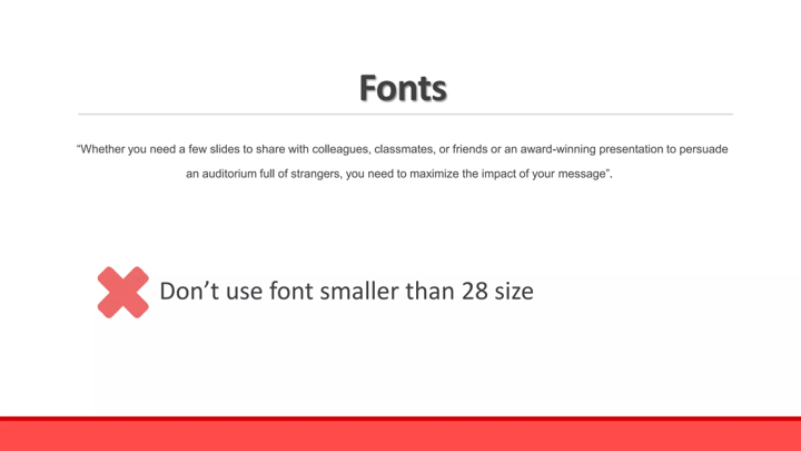
- Font Sizes: Titles 36-44pt, Body text 24-32pt
- File Format: Save as .pptx for editing, .pdf for distribution
- Colors: Limit palette to 3-4 complementary colors
- Images: High resolution (minimum 1280px width)